
Discover What Works: Analyzing FAB Button Clicks Month by Month
In today’s digital world, having a beautiful website isn’t enough — you need a website that works hard for you. That means guiding visitors to take action, whether it’s contacting you, signing up for a newsletter, or exploring more of your content. That’s where the Floating Awesome Button (FAB) comes in — a powerful yet easy-to-use WordPress plugin that keeps important buttons in front of your visitors at all times.
But here’s the game-changer: FAB doesn’t just enhance your site’s functionality — it also helps you understand your audience with its built-in Monthly Click Dashboard. This feature provides a clear, visual breakdown of how users are interacting with your floating buttons month by month. By tracking which actions your users are clicking on most, you can fine-tune your strategy, boost conversions, and improve user experience — all without needing to write a single line of code.
In this article, we’ll take you on a deep dive into the Monthly Click Dashboard, showing you how to make the most of this powerful tool to grow your site’s impact.
What is the Monthly Click Dashboard?
The Monthly Click Dashboard is a built-in analytics feature of the Floating Awesome Button (FAB) plugin that visually displays the number of times your FAB buttons are clicked — organized by month. It provides a bar chart that helps you easily monitor engagement over time, allowing you to identify trends, seasonality, and opportunities to improve.
Each bar on the chart represents the total number of clicks for a given month. For example, a sudden spike in May might indicate that a promotion, call-to-action, or content update was particularly effective. This allows you to answer questions like:
- Which month had the most engagement?
- Did a change in button text or placement affect clicks?
- Is engagement rising or falling?
Here’s what you’ll typically see on the dashboard:
- 📊 X-axis (horizontal): Represents each month from January to December.
- 📈 Y-axis (vertical): Shows the number of clicks.
- 🔵 Blue bars: Indicate the volume of clicks per month.
This data visualization gives you a quick snapshot of your site’s interactive performance, without needing to dig through complex analytics tools.
With the Monthly Click Dashboard, even non-technical users can make data-informed decisions to improve engagement, optimize button usage, and track progress — all from the convenience of the WordPress dashboard.
Why Monthly Click Tracking Matters
Knowing how many people clicked your Floating Awesome Button each month isn’t just a vanity metric — it’s a powerful window into user behavior and intent.
Here’s why tracking monthly clicks is so valuable:
Understand What Works (and What Doesn’t)
By analyzing which months have the highest or lowest click rates, you can pinpoint what changes on your site are driving action. For example:
- Did a new popup in April boost engagement?
- Did changing the button color in March reduce clicks?
These insights help you identify which strategies are effective and worth replicating.
📌 Measure the Impact of Campaigns or Content
Running a sale, launching a product, or promoting a new blog post? The Monthly Click Dashboard shows how those events translate into action. A spike in clicks often correlates with a well-executed campaign — letting you track ROI without extra effort.
📌 Make Smart, Data-Driven Improvements
Instead of guessing where to place buttons or how to phrase calls-to-action, you can base decisions on actual user interaction. If May saw a huge increase in clicks, ask yourself: What changed that month? What can I repeat or improve?
📌 Monitor Long-Term Trends
Over time, you’ll begin to see seasonal patterns and behavioral trends. For example, users might be more active during certain months, or engagement may rise after specific content updates.
In short, monthly click tracking turns your FAB plugin from a static design element into a dynamic marketing tool — one that informs, adapts, and grows with your site.
How to Access the Dashboard
Floating Awesome Button (Sticky Button, Popup, Toast) & +100 Website Custom Interactive Element
Getting to your Floating Awesome Button’s Monthly Click Dashboard is easy — and you don’t need to be a tech expert to find it. Here’s how to access and start using this powerful feature inside your WordPress site:
Step-by-Step Guide:
- Login to your WordPress Admin Panel
Navigate to your website’s /wp-admin URL and enter your login credentials. - Go to FAB Admin Menu
From the WordPress sidebar, look for the FAB menu item. - Select the “Dashboard” Tab
Within the FAB sidebar menu, navigate to the Dashboard tab. This is where all your analytics live. - View the Monthly Click Graph
You’ll see a clean bar chart labeled Monthly Clicks, showing the number of times your FABs have been clicked each month. The bars are color-coded and arranged chronologically for easy viewing. - Hover for Details
Move your mouse over each bar to see exact click counts. Use this info to compare performance over time.
That’s it! No complicated setup, no extra plugins, no developer needed.
The dashboard is automatically populated with click data as visitors interact with your FAB buttons. This means once it’s active on your site, all you need to do is check in regularly to track performance and optimize as needed.
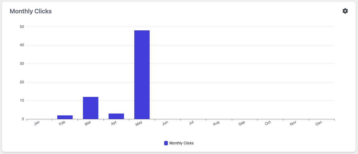
Interpreting the Graph – Case Study: May Spike
Let’s dive into a real-world example to help you make sense of your Monthly Click Dashboard:
Imagine you’re looking at your FAB dashboard and notice a huge spike in May — nearly 50 clicks, far higher than any other month.
So, what does this spike tell you?
🔍 What Might Have Caused the Spike?
Ask yourself:
- Did you run a promotion, discount, or event in May?
- Did you change the FAB’s placement, text, or icon?
- Did you add a new popup, toast message, or CTA tied to a campaign?
Any of these changes can dramatically affect user interaction.
🎯 Actionable Insight
If the spike was intentional — good job! Replicate that formula:
- Use the same CTA phrasing
- Place FAB in the same position
- Repeat campaign timing
If it was accidental, it’s still valuable! You just discovered something that works, even if unintentionally.
📉 And What About Low Months?
Contrast that with quieter months like January or February. These can help you:
- Recognize content gaps
- Spot disengagement periods
- Plan ahead for campaigns during quiet times
🧠 Pro Tip:
Use annotations or a simple content calendar to note what changed on your site each month. That way, when you see a spike, you’ll know exactly why it happened.
By interpreting the graph, you move from passive observation to strategic optimization — the kind of smart thinking that turns clicks into conversions.
Tips to Increase Monthly Clicks
Looking to grow that monthly click count and make your Floating Awesome Button work even harder for you? Here are some proven tips to help you boost engagement and turn casual visitors into action-takers:
1. Use Strong Call-to-Actions (CTAs)
A FAB with “Click Here” is okay…
But a FAB with “📩 Get Your Free Guide” or “🎁 Claim Your Discount” is far more compelling. Make your CTA clear, benefit-driven, and action-oriented.
2. Add Popups or Toasts with Real Value
Give users a reason to click:
- A limited-time offer
- Newsletter sign-up with a bonus
- Quick contact form or chat popup
These interactive elements grab attention and make clicking feel worth it.
3. Optimize FAB Placement
Position matters. Try:
- Bottom-right corner (most common)
- Avoiding areas with overlapping UI
- Testing different placements with A/B testing tools
If users can’t easily see or reach your FAB, they won’t click it.
4. Change Colors or Icons Regularly
Visual fatigue is real. Try switching:
- FAB colors monthly or quarterly
- Icons that match the CTA (“💬” for chat, “⬆” for back to top)
This keeps the button fresh and engaging.
5. Align with Campaigns and Seasons
Planning a big promo or launch? Use your FAB to support it. For example:
- “🎉 Don’t Miss Our May Sale!”
- “⏳ Early Bird Closes Tonight!”
Tie your FAB into broader site goals and marketing activities.
6. Track, Learn, Improve
Always review your Monthly Clicks Dashboard to see what works. Then:
- Double down on high-performing tactics
- Replace low-performing buttons
- Test one change at a time
Consistency and small tweaks lead to big results.
Using FAB Data to Drive Decisions
Your Monthly Clicks Dashboard isn’t just a pretty chart — it’s a decision-making tool. When used strategically, it can help guide your marketing, design, and content choices. Here’s how to make the most of your FAB data:
1. Identify What Resonates
Which months show spikes? Which button CTAs performed best? Use this data to:
- Create more content aligned with high-performing messages
- Prioritize the types of FAB actions that users engage with (e.g., newsletter signups vs. back-to-top)
2. Make Design Decisions Based on Evidence
Use click trends to decide:
- Whether your FAB needs a redesign
- If icon changes impact click rates
- How button size or position affects visibility
Design with data, not guesswork.
3. Plan Campaigns Around Engagement Peaks
If you know May gets a surge in clicks every year, launch your best campaigns then. If August is slow, use FAB to run a flash promo to boost activity.
Turn monthly insights into calendar-aligned strategies.
4. Run Experiments
FAB’s dashboard makes it easy to A/B test:
- “Contact Us” vs. “Let’s Talk”
- Red button vs. green button
- Popups vs. toasts
Use the Monthly Clicks graph to measure what wins — and scale what works.
5. Report to Stakeholders or Clients
If you’re a marketer, agency, or freelancer, FAB metrics help show ROI:
- “We increased clicks by 200% this quarter.”
- “Our May campaign drove 45 new actions via FAB.”
It’s not just data — it’s proof of performance.
Conclusion
The Monthly Clicks Dashboard in Floating Awesome Button (FAB) isn’t just a number tracker — it’s your window into what’s working on your website. With clear, visual data, you can:
- Spot trends and seasonal engagement patterns
- Improve your CTA strategies
- Make smarter design and content choices
- Justify your digital efforts with real metrics
Whether you’re a business owner, developer, or digital marketer, FAB gives you actionable insights with zero complexity.
Ready to turn those clicks into conversions?
Install Floating Awesome Button today and start seeing the numbers that matter most!