
The Ultimate Tool for Tracking Daily Visitors and Driving Conversions via Google Site Kit and FAB
The Floating Awesome Button (FAB) is a user-friendly WordPress plugin designed to enhance website engagement. By integrating visually appealing and functional buttons that remain visible as visitors scroll through your site, FAB makes it easier for users to take action with just one click. Whether it’s to contact you, sign up for your newsletter, or quickly navigate back to the top of the page, FAB provides seamless functionality without any technical know-how required.
This plugin is a perfect tool for website owners looking to boost interaction and improve user experience. With customizable button styles, FAB ensures your website not only looks great but also works smarter to convert visitors into customers.
What is the Daily Visitors Traffic Report?
The Daily Visitors Traffic Report is an insightful tool that provides website owners with a clear and detailed breakdown of daily traffic performance. This report is generated through the integration of Google Site Kit plugin and Floating Awesome Button (FAB), which integrates seamlessly with your WordPress site to track key metrics. The report highlights how many visitors interact with your site on a daily basis, giving you valuable information about user behavior and engagement levels.
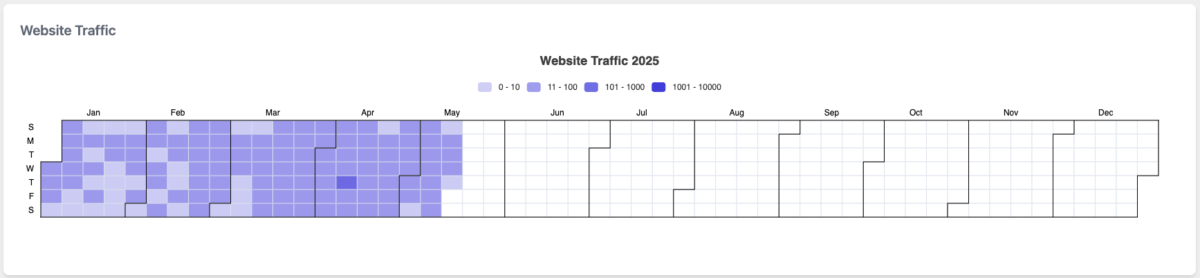
The report is displayed in a grid format, with each square representing a day’s worth of data. This layout allows you to quickly identify traffic spikes, slow periods, and overall trends. Understanding this data is essential for refining your website strategy, optimizing content, and enhancing user experience.
How to Read the Daily Visitors Traffic Report
Understanding how to interpret the Daily Visitors Traffic Report is crucial for effectively analyzing your website’s performance. The report uses a color-coded system to represent different levels of engagement:
- Light Purple (0 – 10 clicks): This color indicates minimal engagement. It suggests that on certain days, your website received very little traffic, or the interaction on those days was low.
- Medium Purple (11 – 100 clicks): A moderate level of engagement. On these days, visitors are actively interacting with your site, but not in large numbers.
- Dark Purple (101 – 1000 clicks): High engagement levels. This indicates that your website saw a considerable amount of traffic, with a substantial number of visitors taking action.
- Blue (1001 – 10000 clicks): The highest level of engagement. Days marked with this color represent peak traffic days, where your website has successfully attracted a large volume of visitors.
By analyzing the grid, you can quickly spot trends in traffic patterns, such as peak days (usually weekends or holidays) or recurring dips (potentially during off-seasons). This allows you to make informed decisions about your content, marketing strategies, and promotional efforts.
Why the Daily Traffic Report Matters for Website Engagement
The Daily Visitors Traffic Report is an essential tool for monitoring website engagement and understanding your audience’s behavior. Regularly reviewing this data enables you to spot patterns, identify opportunities for growth, and make data-driven decisions that can enhance your website’s performance.
Here’s how the Daily Traffic Report helps with conversion optimization:
- Identify Traffic Peaks: By spotting high-traffic periods, you can strategically plan marketing campaigns, promotions, or product launches. For example, if you notice that traffic spikes during weekends or after a specific social media campaign, you can align calls-to-action (CTAs) such as special offers or limited-time discounts to maximize the number of conversions during these times.
- Analyze Low Traffic Periods: Understanding when traffic drops enables you to identify potential issues with your site, such as broken links, slow load times, or ineffective promotions. By addressing these problems, you can ensure that low-traffic periods don’t hinder your overall conversion goals. Additionally, knowing when traffic is lower helps you focus your efforts on improving engagement during these times.
- Optimize Content Timing: The FAB Traffic Report allows you to track daily traffic fluctuations, helping you tailor your content schedule to match when users are most active. If your audience tends to visit during certain hours or days, you can time blog posts, videos, or product launches to coincide with these traffic surges, thereby increasing the chances of converting visitors into customers.
- Track User Behavior with FAB Actions: Since FAB also allows you to track how users interact with actionable buttons (e.g., sign-ups, contact forms, or CTA buttons), you can determine which buttons or actions drive the most conversions. By linking the Daily Traffic Report with user engagement data, you can pinpoint which content or pages generate the most interaction, then replicate or enhance those elements to optimize conversion rates across your site.
- Monitor Seasonal Trends: By analyzing the traffic data over time, you can identify seasonal trends that impact your website traffic. Knowing when your site is likely to receive more traffic (e.g., holiday seasons, back-to-school periods) allows you to plan ahead with targeted conversion strategies, such as promotions or product releases timed for these high-traffic seasons.
How to Access and Use the Daily Traffic Report Feature
Floating Awesome Button (Sticky Button, Popup, Toast) & +100 Website Custom Interactive Element
Accessing the FAB traffic Repoort dashboard in the FAB plugin is simple. Once you’ve installed and activated FAB on your website, you can navigate to the plugin’s dashboard section by going to Admin > FAB > Dashboard > Post Tab. Here, you will find a visual representation of website traffic that is easy to interpret.
The data is displayed in a chart that shows daily interactions with your buttons. The chart uses color coding to represent different levels of engagement, with each color indicating the number of clicks. This intuitive layout allows you to quickly identify patterns and areas that may need improvement.
Use Case: Improving User Engagement and Conversion Rates for an Online Store
Scenario:
Imagine you run an online store that sells handmade jewelry. You recently installed the Floating Awesome Button (FAB) plugin on your site to improve customer engagement, with a focus on encouraging newsletter sign-ups and increasing product page visits.
- Identifying Peak Traffic Days
- Description:
By analyzing the Daily Visitors Traffic Report, you notice that Wednesdays and Sundays consistently show higher engagement with significant spikes in clicks. This could indicate that people tend to shop or browse your store during mid-week or weekend. - Action:
Based on this insight, you schedule special promotions or flash sales on these days, using the FAB plugin to prominently display special offers or discounts. This targeted approach ensures you are engaging customers during their peak activity times.
- Description:
- Optimizing FAB Button Placement
- Description:
After reviewing the report, you identify that certain product pages have high bounce rates, while others are seeing consistent engagement. You also notice that the newsletter sign-up FAB button is receiving less interaction. - Action:
You move the FAB sign-up button to a more prominent location on the page with high engagement. This ensures it’s visible during key moments of the shopping journey, such as when customers are about to leave the page or during checkout. Additionally, you test different styles and messages for the button, using the data from the report to fine-tune your approach.
- Description:
- Understanding Traffic Trends and Customer Behavior
- Description:
Over the course of a month, the Daily Visitors Traffic Report shows that your traffic dips significantly during holidays and national events. Upon comparing the data with external events like Black Friday or a local festival, you notice that while your overall traffic decreases, conversions stay steady. - Action:
You realize that people are still engaging with your site during holidays, but their purchasing behavior changes. With this information, you prepare targeted email campaigns and promotions ahead of holidays, encouraging people to browse your collection and offering holiday-themed discounts.
- Description:
- Testing Button Effectiveness
- Description:
The report shows that traffic is highest on days when your homepage FAB button is activated, but not necessarily on other product pages. You notice that engagement is lower on days when the FAB button isn’t present or when its call to action is less compelling. - Action:
You experiment with different versions of the FAB buttons on various pages (e.g., product pages, category pages, and the checkout page) to see which versions drive the most interactions. Based on the traffic report, you refine your buttons to be more compelling and place them strategically across the site to maximize engagement.
- Description:
Conclusion
The Daily Visitors Traffic Report, provides powerful insights that are crucial for optimizing your website’s engagement and performance. By tracking daily visitor traffic trends, you can make informed decisions that lead to higher user engagement and increased conversion rates.
Leveraging these insights, along with tools like the Floating Awesome Button, empowers you to create a more engaging and user-friendly website, ultimately transforming casual visitors into loyal customers. The ability to act on the data from the Daily Visitors Traffic Report ensures that your website remains competitive, adaptable, and consistently aligned with your audience’s needs.