

Essential UI Tips for Boosting User Engagement Across Device (Desktop, Tablet, and Mobile)
The contemporary digital landscape is characterized by users seamlessly transitioning between diverse devices—desktops, tablets, and mobile phones—to access web content. In this multi-device environment, the effective design and deployment of interactive user interface (UI) elements such as Floating Action Buttons (FABs), Popups, and Toast Notifications are not merely aesthetic considerations but strategic imperatives.
This article dissects the distinct requirements of UI elements across different device categories, providing actionable best practices to ensure optimal user engagement and conversion. It posits that tailoring UI to the specific characteristics and contextual use of each device is a fundamental necessity for digital success.
II. Introduction: The Multi-Device Imperative in UI/UX Design
The modern digital landscape is profoundly shaped by the pervasive use of multiple devices for accessing web content. Users routinely interact with websites via desktops, laptops, tablets, and smartphones, each presenting a unique set of characteristics, including distinct screen sizes, varied input methods (ranging from mouse and keyboard to touch and stylus), and differing typical usage contexts.
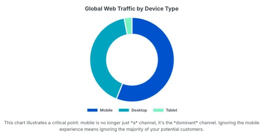
This evolving ecosystem necessitates a nuanced approach to UI/UX design. A significant and undeniable trend is the pronounced shift towards mobile-first browsing, with mobile traffic now constituting over half of all web visits. This fundamental change mandates a re-evaluation of how interactive UI elements are conceived and deployed.
Three critical interactive UI elements are central to this discussion:
- Floating Action Buttons (FABs): These are prominent, typically circular UI elements that visually “float” above the content, signifying the single most important or primary action available on a given screen. They function as clear calls-to-action or intuitive way-finding tools.
- Popups: Also referred to as modal windows or overlays, popups are graphical user interface elements that appear on top of a webpage, temporarily obscuring the underlying content. Their primary objective is to capture user attention and encourage a specific action, such as subscribing to a newsletter, claiming a discount, or providing feedback.
- Toast Notifications: These are small, non-intrusive, and time-bound messages designed to provide brief feedback about system events without interrupting the user’s current task flow. They are characterized by their automatic disappearance after a short duration.
III. Understanding Device Ecosystems and User Behaviors
Optimizing UI elements for different devices necessitates a thorough understanding of each device ecosystem’s unique characteristics and the associated user behaviors.
Desktop Experience
Desktop computers are characterized by their significant processing power, ample storage capacity, and generous memory, enabling faster and more efficient multitasking. They typically feature much larger displays, often supporting multiple monitors, which provides extensive screen real estate for complex tasks such as video editing, programming, or financial analysis.
The presence of full-sized keyboards offers a comfortable and efficient typing experience for extended periods of work or study. While generally less portable than other devices, desktops offer greater longevity and upgradability.
Users primarily interact with desktops via precise input devices like a mouse and keyboard. This facilitates detailed content consumption, complex data entry, and seamless navigation through intricate interfaces. Desktop users frequently engage in demanding workloads that require advanced software and precision input.
Tablet Experience
Tablets are portable electronic devices defined by their touch-sensitive screens, which typically range from approximately 7 to 12 inches. They are designed to be lightweight and convenient for on-the-go use. While primarily touch-driven, many tablets also support styluses for enhanced precision and can be augmented with keyboard attachments for improved typing efficiency.
Tablets occupy a unique middle ground between smartphones and laptops, offering a larger viewing and interaction area than phones while retaining the portability that traditional laptops lack. They are well-suited for media consumption (e.g., streaming movies and TV shows), video calls, educational purposes, and light productivity tasks.
Mobile Experience
Mobile devices, particularly smartphones, are characterized by their small screens and touch-first navigation. They operate with limited CPU power and memory compared to desktops, necessitating highly resource-efficient mobile browsers that compress data and utilize caching techniques to reduce page load times. Mobile devices primarily connect via cellular networks or Wireless LAN.
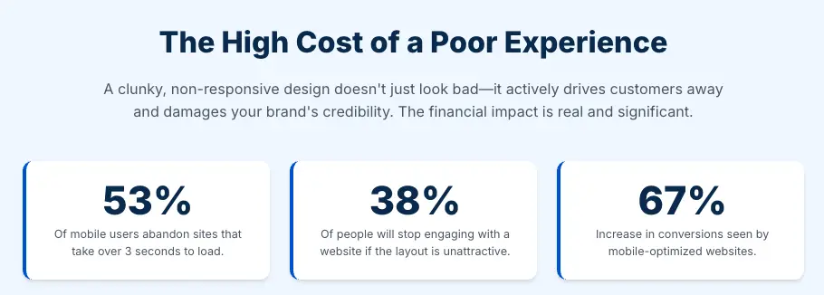
Mobile browsers are specifically optimized to adaptively render web pages to fit smaller screen sizes and resolutions, ensuring content readability and usability. The emphasis on lightweight design is crucial for fast loading, as a significant proportion of mobile users (53%) abandon sites that take longer than three seconds to load.
UI elements must be designed for touch-based interaction, requiring larger, easily tappable buttons, responsive layouts, and intuitive gesture recognition such as pinch-to-zoom and swipe. Mobile users often have shorter attention spans and are frequently multitasking or on the move, necessitating concise information and direct calls to action.
The primary input method—mouse, finger, or stylus—directly dictates the optimal size, spacing, and interactive behavior of UI elements. A mouse pointer allows for pixel-perfect targeting, making smaller buttons or denser UI layouts acceptable on desktops. Conversely, a human finger, being inherently less precise, requires a larger tap target and sufficient clear space around interactive elements to prevent accidental taps on adjacent items.
IV. The “Why”: Importance of Device-Specific UI for Engagement and Conversion
Enhancing User Experience (UX) and Usability
Implementing a truly responsive and adaptive design ensures a consistent, smooth, and intuitive experience across all devices, irrespective of screen size or input method. This consistency fosters user trust and significantly boosts overall satisfaction.
By tailoring UI elements to the specific characteristics of each device, such as designing larger, tap-friendly buttons for touchscreens, interaction becomes effortless, dramatically reducing user frustration. When a website’s interface is well-adjusted and easy to navigate on a user’s chosen device, they are significantly less likely to abandon the site prematurely.
Boosting Conversion Rates and Lead Generation
Empirical data strongly supports the positive impact of mobile optimization on business outcomes. Websites optimized for mobile have demonstrated a remarkable 67% increase in conversions. Beyond mere mobile-friendliness, a well-designed overall interface has the potential to elevate conversion rates by up to 200%.
Popups, when strategically deployed and personalized based on user behavior and device context, are exceptionally powerful tools for lead generation. Some studies indicate over a 100% increase in signup rates when lead magnets are effectively utilized within popups. Clear, action-oriented Calls-to-Action (CTAs) within these device-adapted elements, combined with enticing offers, are crucial drivers for desired user actions, directly translating to sales and sign-ups.
Reducing Bounce Rates and Improving User Retention
Responsive websites demonstrably lower bounce rates by over 30%, indicating that users are more engaged and remain on the site longer. Conversely, users quickly abandon sites that require excessive scrolling (52% of mobile users) or suffer from slow loading times (53% of mobile users abandon if it takes longer than three seconds to load). These issues are frequently exacerbated by non-responsive design. A thoughtfully adjusted interface keeps visitors engaged, fostering repeat visits and building long-term customer loyalty.
SEO Benefits and Mobile-First Indexing
Google has explicitly stated that mobile-friendliness is a significant ranking factor in its search engine algorithms. This implies that websites not optimized for mobile will likely rank lower, thereby reducing their visibility. A high bounce rate, often a symptom of poor responsiveness, negatively impacts search rankings, while a responsive design improves visibility and organic traffic.
Prioritizing mobile optimization is no longer optional; it is crucial for retaining the vast and growing mobile audience segment and ensuring long-term SEO success and discoverability.
Beyond mere functionality, a responsive and well-adapted UI profoundly influences user perception of the entire brand’s quality, professionalism, and trustworthiness. Non-responsive sites can “hurt your credibility” and lead customers to “question the quality of your products or services“. Consumers explicitly “expect modern, mobile-friendly websites“.
Furthermore, a significant percentage of users (38%) will stop engaging with a website if its content or layout is perceived as “unattractive“. This extends beyond a simple functional failure; it is a perceptual one. When a website appears outdated, clunky, or functions poorly on a user’s preferred device.
V. Deep Dive: Device-Specific Best Practices for Key UI Elements

Floating Action Buttons (FABs)

FABs are designed to represent the primary, most important action available on a given screen. They are exclusively used for positive, constructive actions such as “Create,” “Add,” “Share,” or “Explore,” and never for destructive actions like “Delete” or “Archive“. To maintain their prominence and avoid visual clutter, it is generally recommended to have only one FAB per screen. They serve as clear way-finding tools and generate contextual awareness, guiding users on what they should do next.
Desktop Best Practices for FABs
On larger desktop screens, FAB placement can be more flexible due to ample screen real estate. While the lower right corner is a common placement for consistency with mobile, Material Design guidelines suggest considering the upper left corner for expanded window sizes, positioning it as one of the first interactive elements users encounter. A minimum of 24dp from the edge is recommended. The default FAB size (56x56dp) is generally appropriate for most desktop use cases.
For layouts where the primary action needs to be exceptionally prominent, a large FAB can be utilized. On hover, FABs on web products should display a tooltip with an accompanying text label for clarity. They can transform into an “extended FAB” (a larger button with a text label) on larger screens, or, when pressed, expand into a “speed dial” menu to reveal a set of related actions.
Tablet Best Practices for FABs
The lower right corner is often preferred for thumb reach, especially when holding the tablet in portrait mode. A minimum of 24dp from the edge is still recommended. Bottom-center alignment can offer a more neutral and inclusive option, though it might occasionally block underlying content.
A medium FAB or the default size (56x56dp) are generally recommended, balancing visibility with screen real estate. It is crucial to ensure the FAB is sufficiently large and tap-friendly. Tablets, with their stylus support , can also accommodate more precise interactions for specific FAB-triggered actions.
Mobile Best Practices for FABs
The most common and recommended placement is the bottom-right corner, optimizing for thumb reach, especially for right-handed users. A minimum of 16dp from the edge is crucial to prevent edge-of-screen issues. Bottom-center is an inclusive alternative but requires careful consideration to avoid content obstruction. For smaller mobile screens (e.g., screen width 460dp or less), a “mini FAB” (40x40dp) is recommended to conserve screen space while remaining tappable. Otherwise, a medium FAB is suitable for most mobile layouts.
Given the limited screen real estate and touch-first nature, it is paramount that a FAB on mobile represents only the single most important, primary action on that screen. Avoid using FABs for minor, destructive, nonspecific actions, or controls better suited for toolbars. Ensure the icon is clear and understandable, and avoid layering badges or other elements over the FAB.
Popups
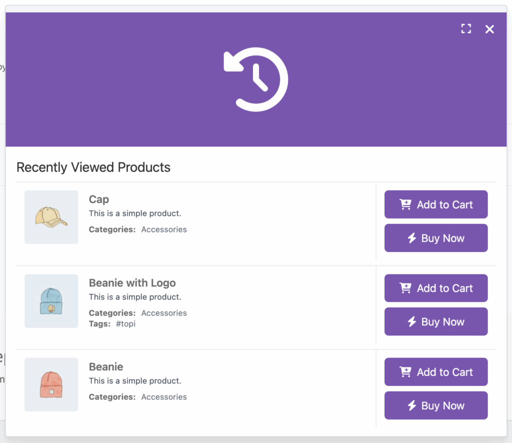
Popups are powerful marketing tools designed to capture user attention and encourage specific actions, such as signing up for a newsletter (lead generatiosan), promoting special offers and discounts, reducing bounce rates (e.g., exit-intent offers), or enhancing customer support (chat invitations). They are highly effective when used strategically, capable of increasing signup rates by over 100% and overall conversions by up to 4 times.
The inherent interruptive nature of popups must be carefully balanced with the perceived value they offer to the user, especially on mobile devices where the cost of interruption is higher. The success of a popup hinges entirely on its “interruption-value trade-off.”
On mobile, where screen space is severely limited and user attention is often fragmented or on-the-go, the “cost” of an interruption (blocking content, disrupting flow) is significantly higher. Therefore, the value offered by the popup (e.g., a highly relevant discount, a personalized offer based on browsing history, or a solution to an immediate problem like cart abandonment) must clearly and significantly outweigh this high cost.
Desktop Best Practices for Popups
Desktop popups can comfortably accommodate more complex layouts, including images and multiple form fields, due to the larger screen size. Utilizing dynamic content placeholders can enhance personalization and relevance.
Effective triggers include :
- exit-intent (when a user shows signs of leaving),
- time-delay (after a specified duration on the page)
- scroll-based (after scrolling a certain percentage)
- interaction-based (e.g., clicking a CTA or hovering over a feature).
A clearly visible “X” button and support for dismissal via the Escape key are crucial for a positive user experience, ensuring users do not feel trapped.
Tablet Best Practices for Popups
Popups must be fully responsive and adapt seamlessly to both portrait and landscape screen orientations. While full-screen modals can work, sidebar or banner popups might be less intrusive for some tablet users, especially on smaller tablet screens, allowing more underlying content to remain visible. Focus on a single, clear call-to-action to avoid overwhelming the user, given the slightly smaller screen compared to a desktop.
Mobile Best Practices for Popups
Mobile popups demand extreme brevity. Concise copy , minimized form fields (often just asking for an email address) , and limited visuals are essential to avoid slowing down loading times or detracting from the main message. All interactive elements—CTA buttons, links, and input fields—must be sufficiently large and have ample spacing to be easily tappable by a finger, preventing accidental clicks. Exit-intent triggers are highly effective on mobile to capture abandoning visitors.
For time-delay triggers, ensure they are sufficiently delayed to comply with Google’s mobile-friendly guidelines. A large, highly visible “X” or close button is paramount; hiding or making it difficult to find will cause significant user frustration. Avoid full-screen windows that completely block content, as they are particularly intrusive on small mobile screens.
Toast Notifications

Toast notifications are designed to provide brief, non-intrusive feedback about system events without interrupting the user’s workflow. They are time-bound, appearing briefly and then disappearing automatically. Common use cases include success messages (e.g., “Profile updated successfully”), non-critical error alerts (e.g., “Failed to load page, try again later”), informational updates (e.g., “New order received”), action confirmations (e.g., “Item deleted”), and simple promotions.
The non-intrusive and transient nature of toast notifications makes them ideal for certain types of feedback, but inherently unsuitable for critical, actionable, or easily-missed information, particularly on mobile devices. There exists a “criticality spectrum” for notifications, with toasts occupying the lowest end. They are perfectly suited for affirmative feedback (“Item added to cart,” “Profile updated successfully”) or non-critical informational updates (“New order received”).
Desktop Best Practices for Toast Notifications
Optimal placement for visibility and minimal disruption is typically the top-center or top-right of the screen. The bottom-right corner is also a familiar placement, particularly due to its use in operating systems like Windows.
Tablet Best Practices for Toast Notifications
It is important to ensure toasts are visible without obstructing critical content, especially given the various screen orientations (portrait/landscape) and potential for users to be holding the device.
Mobile Best Practices for Toast Notifications
Due to limited screen space and often distracted user attention, mobile toast messages must be extremely short and concise. Android 12+ limits toasts to two lines of text, emphasizing the need for brevity. Strategic placement is crucial to avoid covering essential content; top or bottom placements are common.
| UI Element | Desktop Best Practices | Tablet Best Practices | Mobile Best Practices |
|---|---|---|---|
| Floating Action Buttons (FABs) | |||
| Placement | Lower right common; upper left for expanded windows. Min 24dp from edge. | Lower right for thumb reach; bottom-center alternative. Min 24dp from edge. | Bottom-right, optimized for thumb. Min 16dp from edge. |
| Size | Default (56×56dp) or Large for prominence. | Medium (56×56dp). | Mini (40×40dp) for small screens (width < 460dp); otherwise Medium. |
| Key Behavior/Use Case | Tooltips on hover; morph to extended FAB or speed dial menu. Primary, positive actions only. | Tap-friendly; stylus support for precision actions. Primary, positive actions only. | Single, primary action; clear icon; avoid destructive actions. |
| Popups | |||
| Size/Content Complexity | Can accommodate complex layouts, images, multiple form fields. | Fully responsive; sidebar/banner less intrusive than full-screen. | Minimalist; concise copy; few form fields; limited visuals. |
| Trigger Strategy | Exit-intent, time-delay, scroll-based, interaction-based. | Similar to desktop, but consider user context. | Exit-intent highly effective; time-delay must be delayed. |
| Dismissal | Clear “X” button; Escape key support. | Clear “X” button; easy dismissal. | Large, highly visible “X” button paramount; avoid full-screen. Tap-friendly design. |
| Toast Notifications | |||
| Placement | Top-center or top-right for visibility; bottom-right familiar. Avoid obstruction. | Visible without obstructing content; consider orientation. | Strategic, avoid covering content. |
| Message Brevity | Brief, clear, to-the-point. | Brief and clear. | Extremely short, concise (e.g., 2 lines max on Android 12+). |
| Criticality Suitability | Non-critical feedback (success, info); can include subtle action buttons. | Non-critical info; can be missed for important messages. | Unreliable for important messages; use snackbars/notifications for critical feedback. Easy manual “X” dismissal. |
VI. Leveraging “Floating Awesome Button” for Seamless Device Optimization
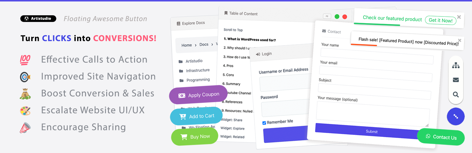
The Floating Awesome Button (FAB) WordPress plugin is engineered to empower website owners, developers, and marketers with extensive, granular control over their interactive UI elements. Available in both free and Pro versions, the plugin offers a rich suite of features designed to facilitate the creation of highly customized, engaging, and device-optimized user experiences.
A pivotal feature addressing the core challenge of device-specific UI optimization is the Custom Filter by Device (Desktop, Tablet, Mobile). This functionality grants precise control over the visibility of Floating Action Buttons and Popups based on the user’s detected device type: Desktop, Tablet, or Mobile.

The plugin’s true power and strategic value extend beyond merely offering a multitude of features; it lies in providing granular control that enables sophisticated, multi-dimensional targeting and optimization. The synergy created by combining distinct filtering and triggering mechanisms allows for highly context-aware UI elements.
For example, a “discount popup” is not simply shown on mobile; it can be precisely configured to only appear for logged-out users (via user session filter) who are on specific product pages (via location filter), browsing on a mobile device (via device filter), and are exhibiting exit intent (via auto-trigger).
Furthermore, the popup content can be dynamically personalized to show the exact product title they were viewing (via dynamic content placeholder). This level of granular, multi-dimensional control moves far beyond simple responsive design; it enables truly adaptive and personalized user experiences.
This capability transforms a website from a static information display into a dynamic, intelligent sales and engagement machine. By delivering highly relevant messages at opportune moments based on a confluence of user behavior, device, and location, it directly impacts lead quality, conversion rates, and long-term customer loyalty. It represents precision marketing and UX optimization delivered directly through the UI.
| Plugin Feature | How it Addresses Device-Specific UI Needs | Benefit for User/Website |
| Custom Filter by Device | Allows precise control over visibility of FABs and Popups (show/hide/alter) based on Desktop, Tablet, or Mobile. Enables different FAB sizes (default/mini) and popup complexities per device. | Ensures optimal UI presentation and interaction tailored to each device, preventing intrusive elements on small screens and underutilized space on large screens. Leads to higher user satisfaction and conversion rates. |
| Stunning Animations | Offers 25+ animation effects for dynamic button/popup appearance. Can be used selectively to enhance engagement without overwhelming, especially on devices with less processing power. | Improves visual appeal and user delight, drawing attention effectively. Contributes to a modern and interactive user experience. |
| Multiple Button Positions & Shapes | Provides flexibility in FAB placement (Left, Center, Right) and over 10 shapes. Allows strategic positioning for optimal thumb reach on mobile/tablet and visual balance on desktop. | Enhances usability and aesthetic integration across diverse screen layouts and user interaction patterns. |
| Dynamic Content Placeholders | Enables personalized messages for popups/toasts by inserting user/site data (e.g., {user_name}, {post_title}). Learn More | Increases relevance and perceived value of popups, crucial for overcoming the “interruption-value trade-off”. Drives higher engagement and conversion. |
| Auto Trigger (Exit Intent, Time Delay) | Triggers popups based on user behavior (e.g., exit intent) or timed delays. Exit intent is highly effective for mobile conversion. Time delays prevent immediate intrusion. | Captures user attention at opportune moments, reducing bounce rates and increasing lead generation, particularly effective on mobile devices where timing is critical. |
| Ability to Change Popup Theme | Offers various themes (Blank, Window Light, Window Dark) for popups. | Ensures popups seamlessly integrate with overall website design, making them feel like a natural extension rather than an external ad, which builds trust. |
| Custom Filter by Location | Allows granular targeting by Custom Post Type, Page/Post, Taxonomies, User Session, User Roles, and Schedule. | Complements device filtering by enabling highly specific, context-aware messaging. Ensures the right message reaches the right user on the right device at the right time. |
| WooCommerce Integration | Provides e-commerce specific UI elements like “Add to Cart” buttons, cart reminders, coupon application, and promotional toasts. | Directly boosts online store performance by offering targeted, conversion-focused UI elements within the e-commerce flow, improving sales and customer engagement. |
VII. Conclusions and Recommendations
The analysis unequivocally demonstrates that optimizing UI elements such as Floating Action Buttons, Popups, and Toast Notifications by device type is not merely a beneficial practice but a fundamental requirement for achieving robust user engagement and maximizing conversion rates in the contemporary digital landscape.
The Floating Awesome Button (FAB) plugin emerges as a highly effective solution for implementing these recommendations. Its “Custom Filter by Device” feature directly addresses the core need for device-specific UI control, allowing for tailored FAB sizes, popup complexities, and overall element visibility based on the user’s device.
Furthermore, its complementary features, including dynamic content placeholders, intelligent auto-triggers (like exit-intent), and granular location-based filtering, empower website administrators to create sophisticated, highly personalized, and conversion-optimized user experiences across the entire multi-device spectrum.
By leveraging such tools, businesses can transform their websites into dynamic, intelligent platforms that not only meet but exceed user expectations, driving sustained engagement and substantial conversion improvements.
Resource


