
How to Capture More Leads for Your Insurance Website with Floating Buttons
In the competitive world of insurance, attracting and converting leads is crucial. Insurance websites face the challenge of engaging visitors and guiding them toward taking action—whether it’s requesting a quote, contacting an agent, or learning more about a policy. One of the simplest yet most effective ways to boost lead generation is by adding floating buttons to your website. These small, interactive elements help draw attention and encourage immediate action from potential customers. Let’s dive into how a floating button can help your insurance website generate more leads.
What Are Floating Buttons?
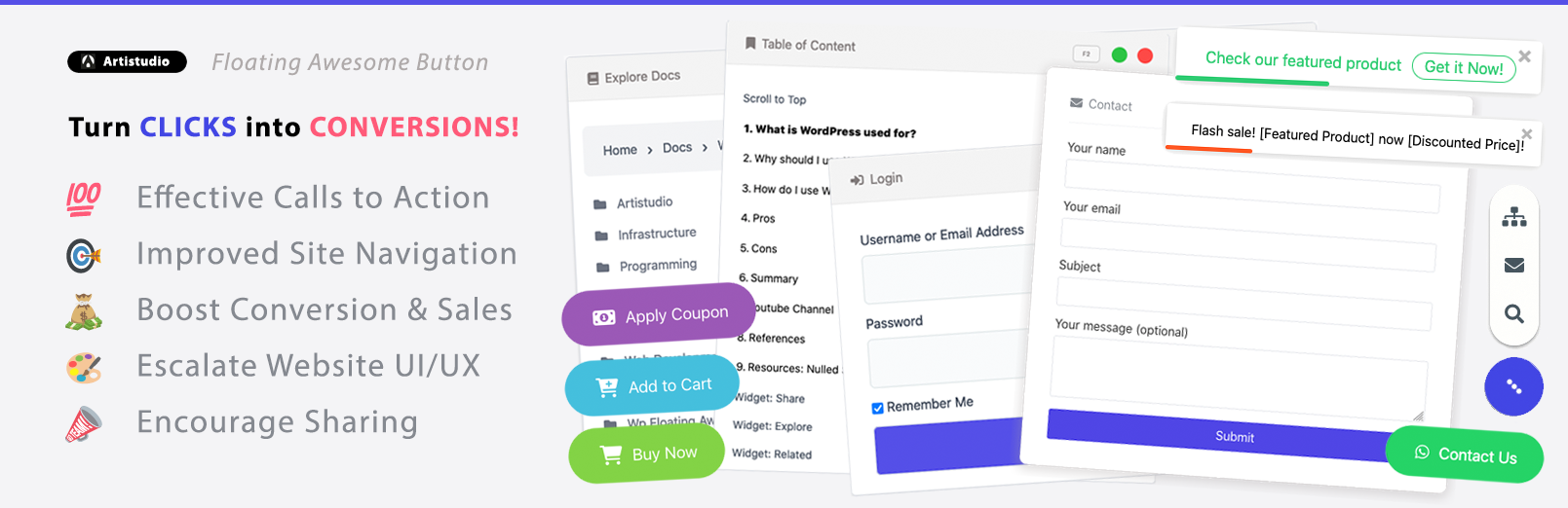
Floating buttons are interactive elements on a website that remain visible and accessible as users scroll through the page. Unlike traditional buttons that stay static in a fixed position or require scrolling to find, floating buttons “float” over the content, making them always available for users to click, no matter where they are on the page. This constant visibility and ease of access make floating buttons a powerful tool for improving user interaction and guiding visitors toward specific actions.
These buttons typically appear in the lower-right or lower-left corner of the webpage, and their small, yet impactful, presence draws attention without being disruptive. The design of floating buttons often features a rounded shape, bold colors, and a clear call to action (CTA), like “Get a Quote,” “Contact Us,” or “Learn More.” They can be customized to fit the style of the website and are typically non-intrusive, blending seamlessly with the design.
Here are a few key characteristics of floating buttons:
- Persistent Visibility: Floating buttons are visible at all times as users navigate through a website. They remain fixed in a corner of the page, even as users scroll up or down. This makes them more likely to catch a visitor’s eye and prompt action.
- Interactive and Action-Oriented: These buttons are designed to encourage user interaction. By providing simple, clear actions—such as “Book Now,” “Get a Free Quote,” or “Start Chatting“—floating buttons help guide users to take immediate steps.
- Minimal Disruption: Floating buttons do not require users to navigate away from the page or interrupt their browsing experience. Instead, they provide a seamless way for users to perform actions quickly without losing context or disrupting their experience.
- Customizable: Website owners have the flexibility to tailor the appearance and functionality of floating buttons to align with their branding. From custom text, icons, colors, and shapes to the choice of the action they trigger (e.g., submitting a contact form, displaying a chat window, or redirecting to another page), the customization options are virtually endless.
Floating buttons are most commonly used for providing easy access to important functions such as:
- Lead Generation: Allowing visitors to quickly request quotes, sign up for newsletters, or contact customer support.
- Navigation: Helping visitors easily scroll back to the top of the page or jump to another section of the site without hassle.
- User Engagement: Encouraging users to start a live chat, schedule a call, or interact with popups that provide additional information.
The reason floating buttons are so effective is because they bring together usability and design in a way that improves the overall user experience. Whether it’s enhancing the navigation of an insurance website or guiding users through the quote request process, floating buttons ensure that your most important actions are always just a click away.
Benefits of Floating Buttons for Insurance Websites
Floating buttons are not just a design trend—they are a powerful tool for improving user experience and boosting lead generation, especially for insurance websites. Here’s a deeper dive into how floating buttons can benefit your insurance website, from enhancing visibility and engagement to improving conversion rates.
1. Increased Visibility and User Engagement
One of the most significant benefits of floating buttons is their ability to remain constantly visible to visitors. Unlike other elements on a page that may only appear during certain actions (e.g., pop-up forms or banners that fade away), floating buttons are always accessible, even as users scroll through the content.
For an insurance website, this means that important actions—whether it’s requesting a quote, contacting an agent, or subscribing to a newsletter—are always within easy reach. Visitors do not have to go searching for a contact form or navigate to a different page to get in touch or get more information. The consistent visibility of floating buttons encourages users to interact more frequently with your website, increasing engagement and guiding them toward specific actions.
2. Clear and Direct Call-to-Action (CTA)
A key component of a successful insurance website is clear and actionable CTAs that guide users toward making decisions. Floating buttons are perfect for creating prominent CTAs that stand out from the rest of the content on the page. Whether it’s “Get a Quote Now,” “Speak with an Agent,” or “Learn More,” the button is designed to capture the visitor’s attention and prompt them to take action.
The simple, direct nature of floating buttons means that users know exactly what to do when they see it. For example, a visitor on your home insurance page may need just a gentle nudge to request a quote. A floating button featuring a CTA like “Get a Free Quote” is all it takes to guide them toward the next step in their customer journey, leading to higher lead conversion.
3. Enhancing Mobile User Experience
With an increasing number of people browsing the web on mobile devices, ensuring a smooth mobile experience is essential. Floating buttons are particularly useful for mobile users as they remain in a fixed position on the screen, making it easy for users to access them without the need to scroll extensively. In fact, floating buttons are more intuitive and accessible than traditional buttons or forms on mobile sites, where screen space is limited.
For insurance websites, mobile optimization is key. Having floating buttons that allow users to take action with a single tap—whether it’s contacting an agent, filling out a quote request, or initiating a chat—can dramatically improve the mobile user experience. This is especially important for the insurance industry, where many potential customers may prefer to access quick information and get quotes on the go.
Examples of Successful Floating Button Implementations on Insurance Websites
Floating buttons are being increasingly adopted by insurance websites worldwide due to their simplicity, functionality, and effectiveness in driving user engagement and generating leads. Many insurance companies have seen significant improvements in user interactions and conversion rates after incorporating floating buttons on their websites. Below are some notable examples of successful floating button implementations that showcase how this tool can transform an insurance website’s user experience and boost lead generation.
1. Geico: Facilitating Quick Contact with Agents
Geico, known for its user-friendly website design, has implemented floating buttons that significantly enhance lead generation and customer interaction. The floating button on Geico’s site prominently displays the option to “Speak with an Agent”, making it easy for visitors to instantly reach out for help or ask questions about policies, coverage, and more.
The button remains visible as users navigate through Geico’s wide range of insurance products, ensuring that the CTA is always within reach. Whether a visitor is looking at car insurance options, home insurance, or life insurance, they can simply click the floating button to speak with an agent in real-time, improving user engagement and boosting lead generation.
The floating button’s ability to prompt immediate interaction with agents has helped Geico create a smoother, more accessible experience for potential customers, contributing to increased conversion rates and a better customer journey.
2. Allstate Insurance: Enhancing Customer Support with Live Chat
Allstate has integrated floating buttons in a way that elevates customer support on its insurance website. The floating button on Allstate’s website doesn’t just serve as a traditional CTA like “Get a Quote.” Instead, it links users to live chat support, allowing visitors to interact with a customer service agent instantly.
This button is designed with a simple chat bubble icon, making it intuitive for users to know that they can start a live conversation. As users browse different insurance products, this floating button remains present, ensuring users can easily initiate a conversation without needing to navigate to a separate page or contact form.
By incorporating this floating button, Allstate has effectively shortened response times, enhanced customer satisfaction, and increased conversions. Visitors who might have otherwise left the site without taking action are now encouraged to engage directly with customer support, resulting in more leads and a better overall customer experience.
3. Liberty Mutual: Maximizing Leads with Multi-Function Floating Buttons
Liberty Mutual has taken the concept of floating buttons a step further by adding multi-functional capabilities to its floating buttons. On their website, floating buttons offer multiple CTAs that change depending on the user’s browsing behavior. For instance, a visitor on the auto insurance page might see a floating button that reads “Get Your Auto Quote Now”, while a user on the life insurance page might see a button labeled “Learn More About Life Insurance Plans.”
This smart use of floating buttons not only provides easy access to important features but also personalizes the user experience. By tailoring the message based on the visitor’s current page or action, Liberty Mutual increases the relevance of the call-to-action, ensuring that it resonates with the user’s intent at that moment.
The result is higher engagement and more targeted lead generation. With personalized CTAs, users are more likely to take the next step in their journey, whether that’s requesting a quote, reading more information, or engaging with a representative.
4. Progressive Insurance: Streamlining the Quote Process
Progressive, one of the largest and most well-known insurance providers, effectively uses floating buttons to enhance its website’s usability and lead generation. On their site, visitors are greeted with a floating button that prominently features a clear call-to-action (CTA): “Get a Quote”.
As users scroll through the homepage or navigate different sections of the website, this button remains fixed at the bottom-right corner of the screen, ensuring it’s always accessible. This placement ensures that visitors can request a quote at any time, no matter what part of the website they are on.
The result? Increased Conversion Rates. The convenience of having a floating button right at their fingertips allows visitors to take immediate action without having to search for quote request forms. By keeping the button visible and accessible, Progressive has successfully reduced friction in the quote request process, leading to higher user engagement and increased conversion rates.
Conclusion
Floating buttons are a powerful tool for any insurance website looking to increase leads and conversions. With their constant visibility, ease of use, and ability to integrate seamlessly with other marketing tools, floating buttons help ensure that visitors take action when it matters most. Whether you want to drive more quote requests, simplify customer contact, or enhance user engagement, adding a floating button can make a significant impact on your insurance website’s success.