
Tracking Website Engagement with FAB’s Daily Clicks Dashboard
In the fast-paced world of online business, engaging your website visitors is crucial for conversion and customer retention. One effective tool for boosting user interaction is the Floating Awesome Button (FAB) plugin. This plugin allows website owners to add visually appealing buttons that stay visible as users scroll down the page, making it easy for them to take action—whether it’s contacting you, subscribing to your newsletter, or navigating to another section of the site.
An essential feature of the FAB plugin is its Dashboard – Daily Clicks feature. This dashboard provides valuable insights into how users are interacting with your website’s FAB buttons. By tracking daily clicks, you can make data-driven decisions to improve user engagement and optimize your website for better results.
What is the Daily Clicks Feature in FAB?
The Daily Clicks feature in the Floating Awesome Button (FAB) plugin provides website owners with an essential tool for tracking user interaction with the floating action buttons placed across their website. As the name suggests, this feature tracks the number of clicks on your FAB buttons on a daily basis, allowing you to gather data on how users engage with your buttons over time.
How It Works
The Daily Clicks feature collects data each day about how often visitors click on your FAB buttons. This could include clicks on buttons for actions like contacting you, signing up for a newsletter, or navigating to other important pages on your site. With this information, you gain valuable insights into user behavior, helping you understand which buttons are most effective in encouraging interactions and conversions.
Understanding the Daily Clicks Dashboard
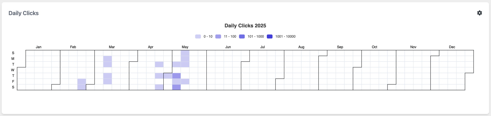
The Daily Clicks Dashboard in FAB is designed to give you a quick, easy-to-read snapshot of daily button performance. It is typically displayed in a visual format, often in the form of a calendar or a heatmap. This graphical representation helps to quickly identify trends in user behavior, such as peak interaction times or dips in engagement.
In the dashboard, each day of the year is represented in a grid-like format, where the rows typically correspond to the days of the week, and the columns represent the months of the year. For example, you may see each individual square or block in the grid representing one day’s worth of data.
The Color Coding Explained
In the graphic of the Daily Clicks dashboard, the colors represent different levels of engagement. The color scheme is typically a gradient that helps you differentiate between various click frequencies. For example:
- Light Purple: 0 to 10 clicks – This might indicate minimal user engagement on that particular day. It could be a quiet day in terms of website traffic or a less prominent button.
- Medium Purple: 11 to 100 clicks – A moderate level of engagement. The button is gaining more attention, but it’s not yet a high performer.
- Dark Purple: 101 to 1000 clicks – This is a high level of engagement, showing that the button is highly effective and receiving considerable interaction.
- Very Dark Purple/Black: 1001 to 10,000 clicks – The highest level of interaction, indicating a highly popular button that attracts lots of attention on that specific day.
This color-coded system provides a quick and clear visual understanding of how well your buttons are performing across different days of the year.
the Graphic (Example)
In the graphic, we can see a heatmap representing Daily Clicks for 2025. The graphic shows the following patterns:
- January to February: We notice lighter shades of purple, suggesting that clicks on the FAB buttons are relatively low during this period. This could indicate that the website has lower traffic in these months, or that users aren’t engaging with the buttons as frequently.
- April and May: In these months, there are several days with medium to dark purple colors, showing an increase in the number of clicks. This could be a result of seasonal campaigns, promotions, or changes in website content that led to greater interaction with the FAB buttons. These spikes could be related to marketing efforts such as discounts or special events.
- June to December: The rest of the year appears to have fluctuating patterns, with some spikes in certain months indicating higher user interaction, while other periods show lower engagement. For instance, a few days in May stand out with very dark purple, indicating exceptional engagement.
This heatmap helps you see when your buttons are most effective and when there are lulls in user interaction, allowing you to adjust your strategy accordingly. The goal is to identify those days and periods where the engagement is highest and replicate the conditions that contributed to this success.
Why Daily Clicks Matter for Website Engagement
The Daily Clicks feature in the Floating Awesome Button (FAB) plugin provides critical insights into user behavior that can significantly impact your website’s engagement levels. By tracking how many times your floating buttons are clicked each day, this feature allows you to understand patterns in user interaction, optimize your website for better engagement, and ultimately improve your conversion rates. Here’s why Daily Clicks matter so much for your website’s engagement:
1. Understanding User Behavior and Preferences
One of the most valuable aspects of tracking Daily Clicks is that it helps you understand how users are interacting with your website. By tracking clicks on your FAB buttons, you can get a clear sense of what visitors find appealing and what actions they are motivated to take.
For instance, if you have multiple FAB buttons, each with a different call to action (CTA), the Daily Clicks feature can show you which buttons are more popular. If a “Contact Us” button is clicked more often than a “Sign Up for Newsletter” button, it’s an indicator that visitors are more likely to engage with a direct contact option. This data helps you make informed decisions about the layout, visibility, and positioning of your buttons, ensuring that you cater to your users’ preferences.
2. Optimizing Conversion Rates
The ultimate goal of any website is to convert visitors into customers, leads, or subscribers. Daily Clicks give you valuable data to optimize your website’s conversion strategy. By tracking when and where users interact with your FAB buttons, you can fine-tune the design and placement of your calls to action.
For example, if you notice that clicks on a certain button spike when a specific offer or content is displayed, you can focus your efforts on replicating that success across other parts of the website. By understanding the click patterns, you can strategically place your buttons where they are most likely to attract attention and convert visitors into engaged users.
Moreover, understanding the timing of engagement can help you implement targeted marketing strategies. For instance, if users are more likely to click on your buttons during certain hours or days of the week, you can schedule campaigns or promotions during those peak times to maximize your chances of success.
3. Improving User Experience (UX)
User experience is at the core of any successful website. If your website is hard to navigate or if users have to search for important buttons, engagement will suffer. The Daily Clicks data helps you assess how easy and intuitive your website is for users.
For example, if you see that your FAB buttons are rarely clicked on mobile devices but receive frequent engagement on desktop, it might indicate that the buttons are difficult to interact with on smaller screens. Alternatively, if certain buttons are clicked frequently but lead to a high bounce rate, it could suggest that users are clicking without finding the information or outcome they expected.
By identifying these pain points, you can make informed decisions about improving the design and placement of your buttons. Whether it’s simplifying the button text, adjusting its size for mobile users, or testing different colors to make it stand out, these improvements can enhance your overall user experience and, in turn, increase engagement.
4. Identifying Successful Content and Marketing Campaigns
The Daily Clicks feature is not just a tool for tracking button performance; it can also help you assess the effectiveness of your marketing efforts. For example, if you’re running a promotional campaign or an ad that includes a specific call to action (CTA), you can track how well that CTA performs by monitoring its click data.
If the click rate is higher during specific promotions or events, it shows you what content or offers resonate most with your audience. Conversely, if you see a drop in engagement, it might be time to reassess your approach. The ability to track the performance of your CTAs daily allows you to test and refine your marketing messages, ensuring they align with what your users want and respond to.
How to Access and Use the Daily Clicks Feature
Floating Awesome Button (Sticky Button, Popup, Toast) & +100 Website Custom Interactive Element
Accessing the Daily Clicks dashboard in the FAB plugin is simple. Once you’ve installed and activated FAB on your website, you can navigate to the plugin’s dashboard section by going to Admin > FAB > Dashboard. Here, you will find a visual representation of clicks that is easy to interpret.
The data is displayed in a chart that shows daily interactions with your buttons. The chart uses color coding to represent different levels of engagement, with each color indicating the number of clicks. This intuitive layout allows you to quickly identify patterns and areas that may need improvement.
Analyzing Data: Key Metrics from Daily Clicks
The Daily Clicks feature in the Floating Awesome Button (FAB) plugin does more than just count the number of times your floating buttons are clicked—it provides valuable data that can be analyzed to optimize your website’s performance. By understanding and interpreting key metrics from the Daily Clicks dashboard, you can gain insights into how users are interacting with your buttons and use that information to improve engagement, conversion rates, and overall user experience. Below, we explore the most important metrics and how to analyze them for better website optimization.
- Click Counts (Total Clicks)
The Click Counts metric tracks the total number of clicks your FAB buttons receive each day. This is the most straightforward and fundamental metric, as it provides a simple indication of how much interaction your buttons are getting.
- What It Shows: Total clicks per day.
- Why It Matters: A higher number of clicks typically indicates that your buttons are attracting user attention and are being used effectively. It’s a good starting point for analyzing user engagement with your website.
- How to Use It: By monitoring the total number of clicks on a daily basis, you can identify which days have the highest user activity. If certain days show unusually high click counts, it could be due to marketing campaigns, content releases, or promotions, and you can use this information to adjust future campaigns.
- Click Trends and Patterns
The Click Trends metric involves analyzing the patterns and fluctuations in daily click data over a specific period, such as weeks or months. This can show how engagement changes over time, helping you identify consistent user behavior or periodic spikes in clicks.
- What It Shows: The trend of clicks over a time period (e.g., weekly, monthly).
- Why It Matters: Identifying trends can help you forecast future engagement, adjust your content strategy, and anticipate changes in user behavior. For example, you may notice that certain promotions or events lead to an uptick in clicks, helping you plan similar initiatives for the future.
- How to Use It: Use click trends to identify seasonal patterns or track how specific campaigns affect user engagement. If a trend shows a spike in clicks after a new product launch or seasonal offer, it may indicate that users are more likely to engage during specific periods.
Leveraging Daily Clicks Data for Website Improvements
The Daily Clicks data provided by the Floating Awesome Button (FAB) plugin is not just about tracking user engagement—it’s a powerful tool that can guide website improvements. By effectively leveraging this data, you can make informed decisions that enhance the user experience, increase engagement, and ultimately improve your website’s performance. Here are several ways you can use Daily Clicks data to drive meaningful improvements to your website:
- Optimizing Button Placement and Design
The placement and design of your FAB buttons directly influence user engagement. Using Daily Clicks data, you can analyze which buttons receive the most clicks and where users are most likely to engage. This allows you to identify patterns and make adjustments to button placement to maximize visibility and interaction.
- What to Look For:
- Which buttons receive the most clicks on specific pages or sections of your site.
- Whether certain buttons are more popular when placed above the fold or in specific locations on a page.
- How to Improve:
- If certain buttons receive higher click counts when placed in a prominent location (e.g., the top of the page or near key content), move other buttons to similar positions.
- Consider the design of the buttons—make them visually appealing, easy to spot, and consistent with your branding.
- Experiment with button size, colors, and shapes to see what generates the most interaction.
- Refining Call-to-Action (CTA) Messaging
A major factor in driving clicks is the call-to-action (CTA) itself. The message on the button plays a critical role in whether users decide to interact. By analyzing Daily Clicks data, you can assess which CTAs are most effective and adjust others accordingly.
- What to Look For:
- The wording and tone of CTAs that consistently perform well.
- If certain phrases like “Sign Up Now,” “Get Started,” or “Learn More” are more effective than others.
- How to Improve:
- A/B test different versions of CTA buttons to identify which message drives more engagement.
- Test alternative phrases or action words that resonate better with your audience, keeping them simple, clear, and compelling.
- If certain CTAs perform better during specific times of the day, consider time-sensitive messaging (e.g., “Limited-time Offer!” or “Hurry, Act Now!”).
- Adjusting Content and Offers Based on Engagement
Daily Clicks data can provide insights into what content or offers drive the most engagement. If users are clicking on buttons that lead to specific pages or promotions, it’s a clear sign that your audience is interested in those topics or offers. You can then optimize your content strategy to focus on what resonates with your users.
- What to Look For:
- Pages or content types that generate higher click rates.
- Whether certain promotions, offers, or product pages are driving more clicks.
- How to Improve:
- Create more content that aligns with the topics or products users engage with the most.
- If a specific promotion is driving high click activity, consider running similar offers or expanding that type of content to other parts of your website.
- Use insights from Daily Clicks data to optimize content placement—ensure that the most popular content is placed strategically on your site.
- Enhancing Mobile Optimization
With more users browsing websites on mobile devices, ensuring that your FAB buttons are mobile-friendly is crucial. Daily Clicks data can help you assess how your buttons are performing on different devices and make necessary adjustments for mobile optimization.
- What to Look For:
- If there is a noticeable difference in the click rates between mobile and desktop users.
- Whether mobile users are engaging with your buttons as frequently or if there are any usability issues, such as buttons being hard to tap or too small to notice.
- How to Improve:
- Ensure that buttons are large enough to be easily tapped on mobile devices.
- Test different button designs to see which are more visually appealing and easier to interact with on smaller screens.
- Consider adding floating action buttons specifically optimized for mobile devices, ensuring they don’t cover important content or become intrusive.
- Adjusting for Seasonal and Time-Based Trends
Seasonality can significantly affect website engagement, especially if you’re running seasonal promotions or time-sensitive offers. The Daily Clicks feature provides insights into when clicks are higher or lower during specific times, enabling you to adjust your strategies accordingly.
- What to Look For:
- Are there certain times of the year (e.g., holidays, sale periods) when clicks spike?
- Do specific days of the week or hours of the day see more engagement than others?
- How to Improve:
- Use time-based trends to plan your marketing campaigns and optimize button visibility during peak times. For example, if you notice more clicks on weekends, schedule promotions or ads to coincide with those times.
- During seasonal peaks, you can make buttons more prominent or feature specific calls to action that align with holiday promotions, special offers, or seasonal content.
- If certain times of day show high engagement, consider timing your content or product launches to coincide with those high-traffic periods.
- Implementing Retargeting and Personalization
By analyzing Daily Clicks data, you can understand the behavior of users who interact with your FAB buttons. This data can be used for retargeting strategies, where you target users who have clicked your buttons but did not complete a desired action, such as making a purchase or signing up for a newsletter.
- What to Look For:
- Clicks that lead to interactions but don’t convert. Are users engaging with the button but not completing the action?
- Click patterns that show users often return to certain pages or offers.
- How to Improve:
- Set up retargeting ads to reach users who clicked but didn’t convert. For instance, you can remind them of an offer they showed interest in or encourage them to complete an abandoned purchase.
- Use personalization tactics by showing tailored content or special offers based on the user’s past interactions with your FAB buttons. For example, if a user clicked on a “Product A” button, consider displaying more related products or exclusive discounts on that product.
Conclusion
The Floating Awesome Button plugin’s Daily Clicks feature offers a powerful way to monitor and improve your website’s user engagement. By tracking how often visitors interact with your buttons, you gain valuable insights into user behavior that can help you optimize your website for higher conversion rates.
Whether you’re a beginner or an experienced website owner, using this data to inform your decisions is crucial for creating a more engaging and user-friendly experience. With the help of the FAB plugin and its Daily Clicks dashboard, your website can work harder for you by turning casual visitors into loyal customers.