
Why Smart Popups Are the Secret to Unlocking Your Blog's Potential
Imagine a website that effortlessly guides your visitors, captures their attention at just the right moment, and encourages them to take action. This is the immense power of well-designed popups.
These dynamic tools are not just fleeting messages; they are direct communication channels capable of getting attention, collecting valuable information, creating powerful calls to action (CTAs), and supplying important updates to your audience. For business owners, this translates directly into tangible benefits: generating leads, boosting subscriptions, and driving conversions that fuel growth.
However, the word “popup” often conjures images of frustration. Many people recall the intrusive, annoying interruptions that hijack their browsing experience, forcing them to scramble for a tiny ‘X’ button or, worse, abandon a site altogether.
This “before” scenario, characterized by poorly implemented popups, can significantly harm user experience and even negatively impact a website’s search engine optimization (SEO). Such experiences create a critical balance point: popups hold immense potential, yet they carry a high risk if not handled with care.
This article introduces a sophisticated solution: the Floating Awesome Button WordPress plugin. This tool transforms popups from a nuisance into a powerful, user-friendly asset. It offers a way to achieve desired outcomes like increased engagement and conversions, all without the common frustrations. The plugin is specifically designed to navigate the inherent paradox of popups by prioritizing user control and non-intrusiveness.
The Double-Edged Sword of Popups: Frustration vs. Fantastic Engagement
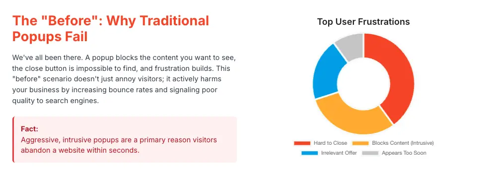
Common Popup Pitfalls (The “Before” Scenario)
One of the most prevalent issues is intrusiveness.
Popups that appear immediately upon page load, before visitors have even had a chance to see the content they came for, are overwhelmingly disruptive and often lead to quick exits.
This aggressive approach is so detrimental that Google actively penalizes sites that use such intrusive pop-ups, particularly on mobile devices, by negatively impacting their search rankings.
Another major source of frustration is the difficulty to close a popup. Tiny, invisible, or even non-existent close buttons trap users, making them feel cornered and leading to immense annoyance and site abandonment. This lack of an easy escape route is a primary cause of increased bounce rates, signaling to search engines that the website is not user-friendly.
Furthermore, irrelevance and overuse can quickly alienate an audience. Bombarding visitors with generic, irrelevant popups, or showing them too frequently, is a surefire way to annoy them and decrease engagement. Users quickly learn to ignore or dismiss popups that don’t offer immediate value or context.
Finally, performance issues are a hidden pitfall. Popups that rely on heavy JavaScript or are otherwise unoptimized can significantly slow down page load times. This negatively impacts crucial Core Web Vitals metrics like First Input Delay (FID) or Interaction to Next Paint (INP), and Cumulative Layout Shift (CLS), which are important ranking factors for Google. A slow-loading or visually unstable page due to popups directly harms SEO performance.
The Shift to User-Centric Design (The “After” Scenario)
The contrast to these pitfalls lies in a user-centric approach to popup design. Effective popups are characterized by their visibility without disruption, meaning they catch the eye without hijacking the entire browsing experience. They are :
- Contextually Relevant, responding to what a user is doing on the site, such as scrolling or hesitating.
- They possess a clarity of purpose, presenting one clear message or offer.
- Their seamless design ensures they fit the brand’s aesthetic and guide the eye effortlessly.
- They respect user control, always providing a clear way out.
The ultimate aim is for popups to engage users, not alienate them; they should feel like a helpful suggestion rather than an unwanted interruption. This approach highlights a fundamental understanding: user experience is the ultimate driver for both SEO and conversion rates.
Beyond the Basics: Floating Awesome Button’s Game-Changing Features
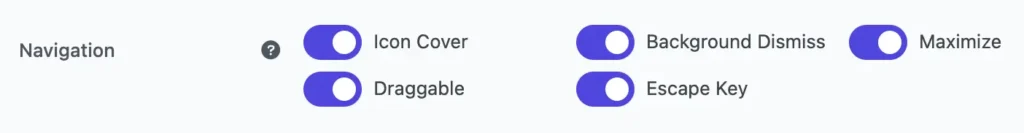
1. Draggable Popups: Giving Your Visitors the Wheel

Imagine a popup appearing on your screen, but instead of being fixed in one spot, you can simply click and drag it anywhere you want. This is the essence of a draggable popup, a feature designed to give your visitors immediate control over their browsing environment.
While not explicitly termed “personalization,” the ability to move a popup allows a user to individually optimize their viewing experience, making the interaction feel more tailored to their immediate needs. This contributes to a “smooth and user-centered interaction”.
Consider this scenario:
- Before: You’re engrossed in a fascinating blog post, and suddenly a popup appears, covering a crucial paragraph. You have to stop reading, hunt for the tiny ‘X’, and close it, completely interrupting your flow. Annoying, right?
- After: The same popup appears, but with the Floating Awesome Button, you simply drag it to the side, instantly revealing the content underneath. You continue reading without missing a beat, and the popup remains visible for you to engage with when you’re ready. This creates a seamless and intuitive experience.
This ability to drag a popup offers a form of “soft dismissal” or “temporary deferral.” Instead of feeling compelled to close an unwanted popup, which can lead to frustration and a higher bounce rate, users can simply move it out of their immediate line of sight.
This feature is not merely a convenience; it is a strategic tool designed to reduce bounce rates and improve the quality of engagement. It allows the popup to remain “on offer” rather than being immediately rejected, fostering a more positive brand interaction.
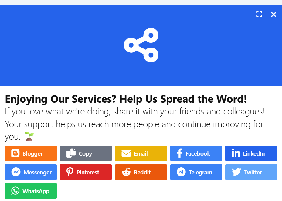
2. Background Dismiss: The Gentle Escape Route
This feature allows your website visitors to close a popup simply by clicking anywhere outside of it, on the background content of your page. There is no need to hunt for a specific “X” button.
This functionality directly respects user autonomy; users should always feel in control of their experience. It provides an intuitive and immediate way to dismiss a popup, preventing the feeling of being trapped or forced to interact.
It significantly reduces frustration and annoyance. One of the biggest popup mistakes is an “impossible close button“. Background dismiss eliminates this frustration, making the popup “easily dismissible“.
Consider this scenario:
- Before: A popup appears, and you desperately scan for the tiny ‘X’ button, perhaps even accidentally clicking on the popup itself and triggering an unwanted action. Frustrating!
- After: With Background Dismiss, a popup appears, you glance at it, decide it’s not for you right now, and instinctively click anywhere outside it. Poof! It’s gone, and you’re back to browsing effortlessly.
3. Escape Key Dismiss: The Power of a Single Press
This feature allows your website visitors to close any active popup by simply pressing the “Escape (Esc)” key on their keyboard.
This provides enhanced accessibility and speed. For many users, especially those who prefer keyboard navigation or are power users, the Esc key is an intuitive and fast way to “exit the current context“. It makes interaction quicker and more efficient.
Offering standard keyboard shortcuts is a hallmark of well-designed applications and websites, signaling attention to detail and a commitment to a smooth, professional user experience. The Esc key is a widely recognized shortcut for closing dialogs or canceling actions across operating systems and applications.
Consider this scenario:
- Before: You’re filling out a form in a popup, realize you made a mistake, and have to reach for your mouse, find the “Cancel” or “X” button, and click it.
- After: You’re in the same situation, but instead, you just hit the “Esc” key. The popup closes instantly, allowing you to quickly correct your course or move on. Much faster!
While seemingly a minor detail, offering keyboard shortcuts like Esc key dismissal demonstrates a deeper level of user experience maturity. It suggests that the website owner, considers various user interaction preferences, including those with accessibility needs or those who simply prioritize keyboard efficiency.
4. Maximize Button: Information on Demand, Not Overload
This feature allows a popup, initially appearing in a smaller, non-intrusive size, to be expanded to a larger view (e.g., full screen or a larger modal) at the user’s discretion.
This provides user-driven information access. Instead of overwhelming users with a large popup from the start, this allows them to choose when and if they want to dive deeper into the content. It respects their browsing journey. You can present a concise offer or notification in a small popup, and if the user is interested, they can maximize it to see more details, sign-up forms, or even a full product overview.
This ensures contextual content delivery and relevance. Starting with a smaller popup is less intrusive and particularly beneficial for mobile devices where screen real estate is limited. The maximize option allows for detailed viewing only when needed, maintaining a “responsive popup design“.
Consider this scenario:
- Before: A large, full-screen popup blasts onto your screen, demanding your attention and making you feel overwhelmed by the amount of information or fields. You immediately close it.
- After: With the Maximize Button, a small, elegant popup appears in the corner, offering a quick headline. Intrigued, you click the “Maximize” button, and it smoothly expands to reveal a detailed offer, a video, or a comprehensive form, all at your command. You control the experience.
5. Enhancing User Engagement with Icon Cover in Popups
Imagine a popup that not only appears on your screen but also features an eye-catching icon right within the popup itself. This is where the Icon Cover setting comes into play, allowing you to display an icon that covers a part of the popup, creating a more visually engaging and interactive experience for the user.
While this may seem like a small design tweak, the Icon Cover setting can have a significant impact on user perception and interaction. By strategically placing an icon within the popup, you immediately draw attention to key elements, making the popup feel more integrated and less intrusive. It serves as both a visual cue and an interactive element that enhances user engagement.
Consider this scenario:
- Before: A generic popup appears with just a plain message, perhaps with a call-to-action button at the bottom. While it may communicate the intended message, it lacks the visual impact that could spark curiosity or enhance the user’s emotional connection with the content.
- After: The same popup now includes an icon cover that adds a layer of visual interest. Imagine a sleek shopping cart icon on an e-commerce site, embedded within the popup’s design. The icon not only draws attention but also provides a subtle hint about the content or action the popup is promoting—whether it’s a sale, new product, or offer. The user feels more inclined to explore the popup because it’s visually appealing and contextually relevant.
The Icon Cover setting goes beyond simple aesthetics; it also adds a sense of personalization and relevance. By incorporating an icon that aligns with your brand’s identity or the specific action you want users to take, you create a more cohesive and compelling experience. This design choice contributes to a stronger brand presence and can drive more meaningful interactions, helping you increase conversions and reduce bounce rates.
Ultimately, the Icon Cover setting is a powerful tool to make your popups stand out without feeling overbearing. It transforms the popup from a simple interruption into a visually dynamic and strategically engaging element that adds value to the user experience.
The Bottom Line: How These Features Drive Conversions and Boost Your SEO
To further illustrate the tangible benefits, consider the following comparison:
| Feature Category | Traditional, Annoying Popups | Floating Awesome Button’s Smart Popups | Why It Matters for Your Business |
| User Control | Limited/None (fixed, hidden ‘X’) | Draggable, Background Dismiss, Escape Key Dismiss (User in charge) | Happy visitors stay longer, explore more, and are more likely to convert into leads or customers. |
| Intrusiveness | High (blocks content, immediate) | Low (appears strategically, can be moved/dismissed easily) | Reduces site abandonment and prevents negative perceptions of your brand. |
| Frustration Level | High (trapped, annoyed) | Low (seamless, intuitive interaction) | Keeps visitors engaged, transforming potential annoyance into appreciation for your site. |
| Mobile Experience | Poor (covers screen, hard to close) | Excellent (responsive, user-controlled positioning) | Crucial for mobile-first indexing and effectively reaching the vast majority of online users. |
| Bounce Rate Impact | Increases significantly | Decreases, promoting longer visits | Signals to Google that your site is valuable and relevant, improving your SEO performance. |
| Conversion Potential | Low (due to negative UX) | High (engages users at the right time, with respect) | Leads to more sign-ups, increased sales, and a greater number of valuable leads for your business. |
| SEO Impact | Negative (poor UX signals, slow load) | Positive (good UX signals, better Core Web Vitals) | Results in better search rankings and increased organic traffic to your website. |
Making It Work for Your Business: Practical Tips
Even with the most intelligently designed features, the effectiveness of popups hinges on strategic implementation and continuous optimization.
Strategic Implementation
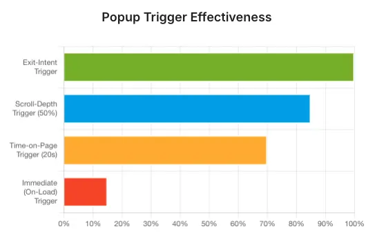
Timing is Everything: Avoid the common mistake of displaying popups immediately upon page load. Instead, implement exit-intent popups, which appear as a user is about to leave, or time-delay popups, appearing after a user has spent 10-30 seconds on a page. Alternatively, use scroll-triggered popups, which activate after a user scrolls 30-50% down the page, indicating engagement. This ensures visitors are already engaged with your content before the popup appears.
Contextual Relevance: Tailor your popup message and offer to the specific page content or the user’s behavior. For example, if a user is browsing a specific product category, a popup offering a discount on related items will be far more effective than a generic newsletter signup.
Clear Call-to-Actions (CTAs): Make your CTA prominent, action-oriented, and benefit-driven. Instead of “Submit,” use phrases like “Get My 20% Discount” or “Start My Free Trial.”
Keep it Simple & Valuable: Focus on delivering one clear message and providing genuine value to the user. Avoid overwhelming visitors with too many input fields in your forms; data suggests conversions drop significantly with more than two input fields.
Match Your Brand: Ensure the popup design, including fonts, colors, and imagery, is consistent with your website’s overall aesthetic. Popups should feel like a natural extension of your brand, not a jarring interruption.
Conclusion: Empower Your Blog, Delight Your Audience, Grow Your Business
The Floating Awesome Button WordPress Plugin, with its intelligent popup navigation features—including Draggable, Background Dismiss, Escape Key, and Maximize Button—fundamentally transforms the user experience on your website. These capabilities move popups from being a source of annoyance and frustration to becoming a powerful, respectful, and highly effective communication channel.
By prioritizing user control and non-intrusiveness, you are not merely being “user-friendly”; you are actively driving higher engagement, achieving lower bounce rates, improving your website’s SEO, and ultimately, generating more conversions and accelerating business growth. These features enable your website to work smarter, adapting to user preferences rather than dictating them.
The result is a more harmonious online experience that benefits both your visitors and your bottom line. Embracing these smart popup features is an essential step for any modern blog or business website aiming to thrive in today’s competitive digital landscape.